Tags

Posted by Two Kellys | Filed under Uncategorized
24 Tuesday Apr 2012
20 Friday Apr 2012
Posted in Inspiration
Tags
It’s here!!! We are so excited to look through this special edition. Have you perused it yet? What are your favorite ideas or rooms?? After a quick glance we were especially taken with the back page. Enjoy the weekend and nice weather – this would make the perfect companion for an afternoon in the park!
TK
19 Thursday Apr 2012
Tags
Glass floats have long been a collectible item for many people. We are lucky to have found a few a couple of months ago and have them for sale in the shop now for $88 each. Our floats are actually quite large and a really beautiful shade of green, the hottest color for Spring (it’s in all of the magazines, if you haven’t noticed)! We have gotten quite a few questions about floats and their history, so I thought I would take this opportunity and give a brief synopsis.
In the mid 1800s fishermen in Norway started producing glass floats to keep their fishing nets afloat. Their use became very widespread across Asia, especially in Japan, in the beginning of the 20th century. In Japan, Sake bottles were recycled into glass floats. Because of the increased need and desire to use them on nets, glass float production evolved from handblown to being made in molds. If a glass float has a seam around it, it was made in a mold. It’s estimated that thousands of floats roam the Pacific Ocean, as well as some being trapped in ice in the Arctic Circle. Because of ocean currents, most of these wayward floats come ashore on the beaches of the Northwest and Alaska – get out there on those beaches and find some floats! If you ever find one without a seam, we would love to see it!
We are in the process of organizing an exciting event here at the shop! Stay tuned for an announcement in the next few days.
TK
12 Thursday Apr 2012
Tags
So this morning, we were lucky enough to have a juicing lesson from Ginny Morris, owner of Running Elements across the street from the shop. We have known Ginny for years, all the way back to our pre-Main Street days. She is always so much fun to be around and we had a great time learning about this craze! Enjoy some pictures from our fun morning and get out that juicer!
TK
10 Tuesday Apr 2012
Posted in Inspiration
Tags
Source: img5.visualizeus.com via Jessica on Pinterest
07 Saturday Apr 2012
Posted in Design
Tags
Benjamin Moore, design, Easter, Farrow & Ball, interiors, paint, spring
Pastel green can mean many things: minty green, light apple green, sage green. This was a tough one – it could be because this color doesn’t exactly excite me. While I think it’s beautiful, I think light green, especially sage, has really been played out over the last 10 years – does Restoration Hardware’s Silver Sage paint color ring a bell?? It seemed like for a time, this color was everywhere. I really had to dig around to find rooms that weren’t so obviously from last decade. I decided to focus more on historical looking interiors. If I had my druthers, this color would exist only in kitchens.
Pastel green is a color that lends itself well to antiques, especially the washed out Swedish variety. The other two colors this week, pink and blue, work well with touches of black, but when added to light green, the room can get way too contemporary looking. If you want to add a dark accent, I would suggest a hunter green or a darker blue-green. A little red-orange would go a long way, too adding some good variety. I think this room does a good job at making the sage walls look classic, not trendy:

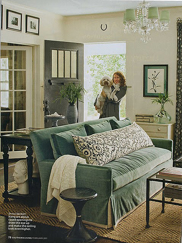
There is a good mix of greens in this room from Southern Living. I noticed that most of the rooms I found (and liked) were from the South.

Barry Dixon loves green and I think he is the most successful at translating it into a beautiful space, perhaps because he takes such a traditional, historical approach to a design. The next few images are from homes he has worked on.

Another Barry Dixon room - the framed prints are offset nicely by that green wall. Also, I like the color of the leather on the chairs. It's an interesting alternative to brown.

More mint than sage, this wall color is appealing to me. And I like that the wall with the built-ins and TV is lacquered. It looks more like furniture.

A contemporary space using pastel green - the simplicity makes it work, but I hate that coffee table!

Axel Vervoordt - a master at washed out colors. Here he has used the aged zinc tub to inspire the rest of the colors in the space adding more of a green gray.

You would have to absolutely love this color to commit to it in this quantity. Do you think you could handle it?

Farrow & Ball's French Grey paint creates the green in this room. It mixes well with the leather - I like this wall color a lot.

Bunny Williams uses green in her designs occasionally. This is from a feature Lonny Magazine did on her design studio.

A green Bunny living room. She has mixed in some orange as an accent. (What is on that throw rug though???)

Extremely traditional bedroom designed by Charlotte Moss. She usually mixes blue and white with green.

My favorite picture of the post, this is a guest room at Blackberry Farm in Tennessee. It should be so cottage looking, but it is surprisingly sophisticated with the clean lines of the furniture and the contemporary art.
There is a very fine line between tasteful and retched when it comes to green paint colors. For some reason, I think this color more than pink or blue can look like a nursery, since it’s gender neutral. I would suggest looking at historical colors to find a green paint color. Farrow & Ball is the best resource. Instead of going all out with a saturated green, maybe think about using a light cream with a lot of green – that way you get the color without losing any warmth.
Hope everyone has a nice weekend! TK
06 Friday Apr 2012
Posted in Design
Tags
Benjamin Moore, design, Easter, Farrow & Ball, interiors, paint
Decorators have been using light blue forever because it’s a color that acts like a neutral. Most people want their homes to be serene escapes from the rigors of their lives and the best way to accomplish that is to introduce some light blue. While looking for images for this post, I found so many pale blue bedrooms – there are definitely a few designers out there who do almost every bedroom in some shade of blue. I was kind of shocked actually when I saw that. They are beautiful spaces, but how could that stay interesting? That subject is a posting in itself, so back to blue.
The best way to use blue and not have it look cutesy is to pair it with furniture that has clean lines and a bit of a presence. You don’t want anything too frilly or it gets very feminine. Also, be careful of adding in a lot of white and stripes. The blue can take it into a beach look, which is fine if that’s what you want to accomplish, but if it’s in your living room at home, maybe you want to steer clear of that only because it’s so specific and can date itself quickly! The first picture below is very successful in it’s use of pale blue. The camel and black work really well with the blue walls at upping the sophistication level of the room. Check out the rest of our Greatest Hits: The Blue Edition below…

Another Vicente Wolf blue room. I love the creaminess of the walls. This would not have been successful had the walls been white.

Designer Steven Grambel uses a lot of blue in his interiors, too. I like that the woodwork is blue instead of the walls.

For this entry, Steven Grambel has mixed blue in with purple - one of my favorite color combinations.

Less bright than the previous two, I have loved this Steven Grambel room ever since I saw it in a magazine a few years ago.

Clarence House, Prince Charles's home in London, has light blue walls. This is a really great space - it looks so homey.

In this light blue hallway, Phoebe Howard has mixed dark antiques with camel for a traditional look.

Michael S. Smith used blue in his design for a guest room. I like everything about this - he took a small space, committed to a color and the results are really fantastic.

An interesting use of blue, purple and yellow. They are all about the same level of saturation, which is generally difficult to pull off.

Who doesn't love blue hydrangea? For those of us who might not be able to commit to an entire blue room, a few stems of these in a vase would be a great accent.
And now for a few paint colors if you are feeling brave enough to paint. I grew up with blue walls in our kitchen, so I have no aversion to blue paint. Here are a few tried and true classics, some on the green side because a blue green is just inherently more interesting to look at for long periods of time.

Benjamin Moore, Patriotic White 2135-70. This is Vicente Wolf's favorite - I would trust him since he is a big blue fan.

Benjamin Moore, Horizon OC-53. I found this color through Lonny Magazine and we used it in a client's bedroom. It's beautiful - especially in the fickle Northwest light.

Benjamin Moore, Woodlawn Blue HC-147. This is the color on my mother's kitchen walls. It's a fabulous blue-green.
Tomorrow look for pastel green. This is going to be a challenge!
TK
05 Thursday Apr 2012
Posted in Design
Tags
Benjamin Moore, Easter, Farrow & Ball, interiors, paint, pink
For the next three days, our blog is dedicated to the lovely pastel colors of Easter – today is PINK. I love a good pink room, but it can be hard to pull off without looking like a little girl’s room. The key is in hue and saturation. Look for pinks with more orange and less bright, light pink. There is something so soothing and comfortable about it in it’s pastel version – we aren’t talking about hot pink here, but pastel doesn’t have to mean baby pink. Not to mention, the glow cast on skin in a pink room is extremely flattering. No other color accomplishes the same feat. Here are some greatest hits – the pink edition…

This is a really great use of cream and pink together - it's light and calm, but still sophisticated.

Phoebe Howard designed bedroom. I am fairly certain this is a Farrow & Ball paint color - it's listed at the bottom with some additional paint colors that work well.

A pink office - notice the black chair. The use of a dark color with pink makes it more sophisticated, less little girl.
The key is to get the paint color right if you are committing to pink on the walls. You will notice that these colors are all a little more on the coral side – it is really difficult to pull of a true pink in an interior if it’s anything more than a pillow. That said, here are a few paint colors that have worked in the past:
Tomorrow, I will tackle light blue – another challenging pastel!
TK
02 Monday Apr 2012
Posted in Inspiration
Tags